
Latest News
2022 Start working on a new website
BBS Trading Expert
Watch the Youtube BBS video and here is a crude oil trading example
Want to know more about:
AXIOM business books awards, bronze medal! Thank You!
No longer available!
Favorite articles in 2010, 11, 12, 14 and 2015 S&C Readers' Choice Awards.

AXIOM Business Books Awards, bronze medal.

Stocks Technical Analysis Basics
Technical analysis starts with the graphical representation of stock prices in a chart. Let’s have a look at the different charts and which type provides the most information.
Charts
Although there are many charts, the ones listed below are those used most often, and the candle chart is preferred because it provides the most information.
Special offer: "Capturing Profit with technical Analysis"
Line Chart
A line chart is not used much anymore. It was the basic chart used prior to the advent of the personal computer. Stock price data was registered manually, and only closing prices were registered.
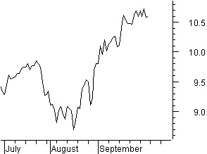
The line chart was created connecting the closing prices (figure 4.1).
Figure 4.1: Line chart.
Bar Chart
The highest and the lowest prices in the given period (minutes, hours, days, weeks, and months) are connected with a vertical bar.
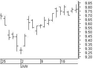
In figure 4.2, the opening price is represented by the tick mark at the left side; the closing price is represented by the tick mark at the right side.
The bottom and the top of the vertical bar represent the lowest and highest prices of the period, respectively.
The bar chart is used mostly in Western technical analysis.
Figure 4.2: Bar chart
Candle Chart
The candle chart has its roots in the Far East. It is believed that Mr. Homma, a Japanese rice merchant, used candle charts for the first time around the year 1850. Steve Nison introduced the candle chart to the Western world in his book, Japanese Candlestick Charting Techniques.
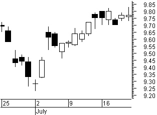
Candle charts clearly depict price development in a trading period. The body of the candle in figure 4.3 represents the move between the opening and closing prices.
If the price closes above the opening price, the candle body is blank (white). If the stock price closes below the opening price, the candle body is filled (black).
Figure 4.3: Candlestick chart.
A candle can be either a body or a body with long or short wicks, called shadows that reach to the highest and lowest prices in the trading period.
The recognition of candle-chart patterns is a study unto itself. We will discuss most of these patterns in chapter six. LOCKIT basically uses candle charts because candle patterns are part of the decision making process and most common used on the daily charts.
Technical Analysis basics Next -Previous -Part 1 -Part 2 -Part 3 -Part 4 -Part 5
STOCATA Stocks Technical Analysis HOME
Links
Find a Stock ticker symbol, enter the ticker and find a chart, news, fundamentals and historical quotes.
Risk Disclosure: Futures and forex trading contains substantial risk and is not for every investor. An investor could potentially lose all or more than the initial investment. Risk capital is money that can be lost without jeopardizing ones’ financial security or life style. Only risk capital should be used for trading and only those with sufficient risk capital should consider trading. Past performance is not necessarily indicative of future results.
Hypothetical Performance Disclosure: Hypothetical performance results have many inherent limitations, some of which are described below. no representation is being made that any account will or is likely to achieve profits or losses similar to those shown; in fact, there are frequently sharp differences between hypothetical performance results and the actual results subsequently achieved by any particular trading program. One of the limitations of hypothetical performance results is that they are generally prepared with the benefit of hindsight. In addition, hypothetical trading does not involve financial risk, and no hypothetical trading record can completely account for the impact of financial risk of actual trading. for example, the ability to withstand losses or to adhere to a particular trading program in spite of trading losses are material points which can also adversely affect actual trading results. There are numerous other factors related to the markets in general or to the implementation of any specific trading program which cannot be fully accounted for in the preparation of hypothetical performance results and all which can adversely affect trading results.
See more 'Legal Disclosures' in the bottom menu bar!